Rider Magazine has been America's number one magazine and media outlet for motorcycle touring, travel and adventure since 1974. While print media is still their primary product, the team at Rider Magazine recognized a need for improvement in the design of their digital product and reached out for help.
Team: Stephanie Pritchard, Dimple Patel, Aileen Morris
Role: Project Manager, Research, UX and UI Design
Timeframe: 3 weeks
Tools: Sketch, Adobe Illustrator, Adobe Photoshop, Marvel
Objective: Redesign the information architecture and visual appeal of ridermagazine.com. By better reflecting the importance of adventure and touring within the community, enable site visitors to more fully engage with the Rider brand, transitioning unique page views from curious visitors to committed readers.

Client Objectives

Background

Rider Magazine began in 1974 as a motorcycle publication written by and for passionate riders.
The magazine delivers comprehensive road tests, touring stories, product evaluations, technical features.
It is the largest all-brand motorcycle touring magazine in the U.S with monthly circulation around 130,000 issues.

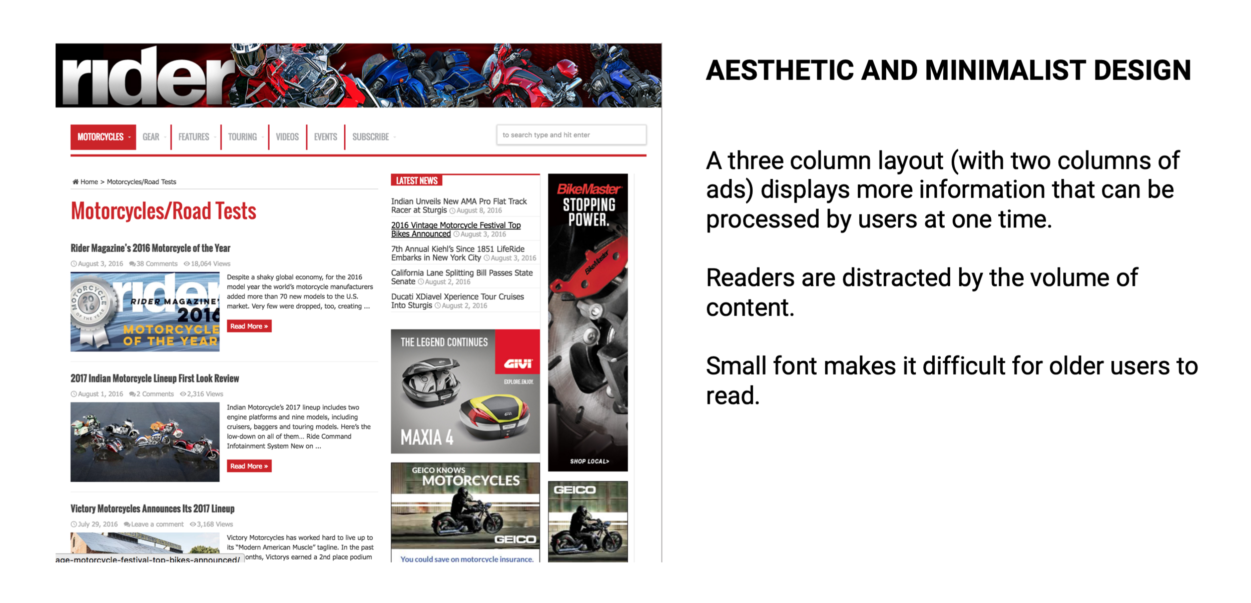
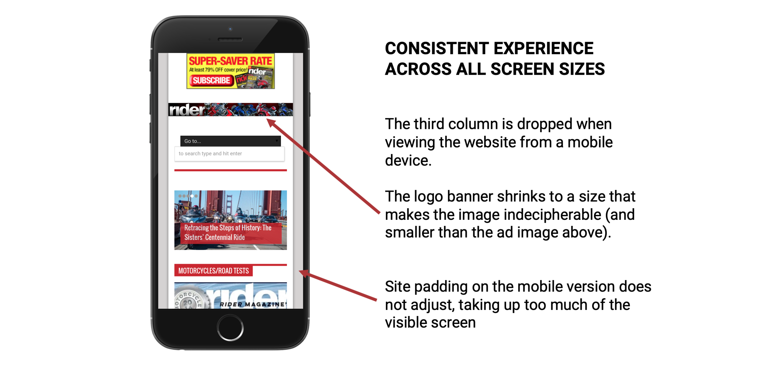
Heuristics Evaluation
Google Analytics

What pages are people viewing the most?
It was no surprise that the Rider home page had the most views.
It was also no surprise that the index of motorcycle reviews had significantly more views than any other page as it was being pushed through above-the-fold links and media posts.
Prior to this project, Rider assumed that nearly all of their brand loyalty came from their reviews of motorcycles and other related products.
And for that reason, what did come as a surprise were the next two most visited pages. Both longer form feature pieces had nearly double the views of any single review.

Where are people spending most of their time?
With a project goal of increasing time on page, we also looked at where users were spending the most time.
Again, we saw a longer form feature piece taking the top spot with nearly 500% more time on page than any other.
Customer Survey Highlights

A 2015 subscriber survey indicated that readers agreed on a need for more content focused on touring.
User Interviews

In interviews with 18 users, there was a consensus on a need for improved aesthetics of the site, but what we found most interesting, was that half those that we talked didn’t understand the purpose of the website / company - “do they sell products?”
So we asked Rider about their ‘Why?’ What is their purpose? What sets them apart from their competitors?

User Persona

Early Designs
With a representative user in mind and and an idea of how he might visit and actively engage with ridermagazine.com distilled from statistics, we began designing.
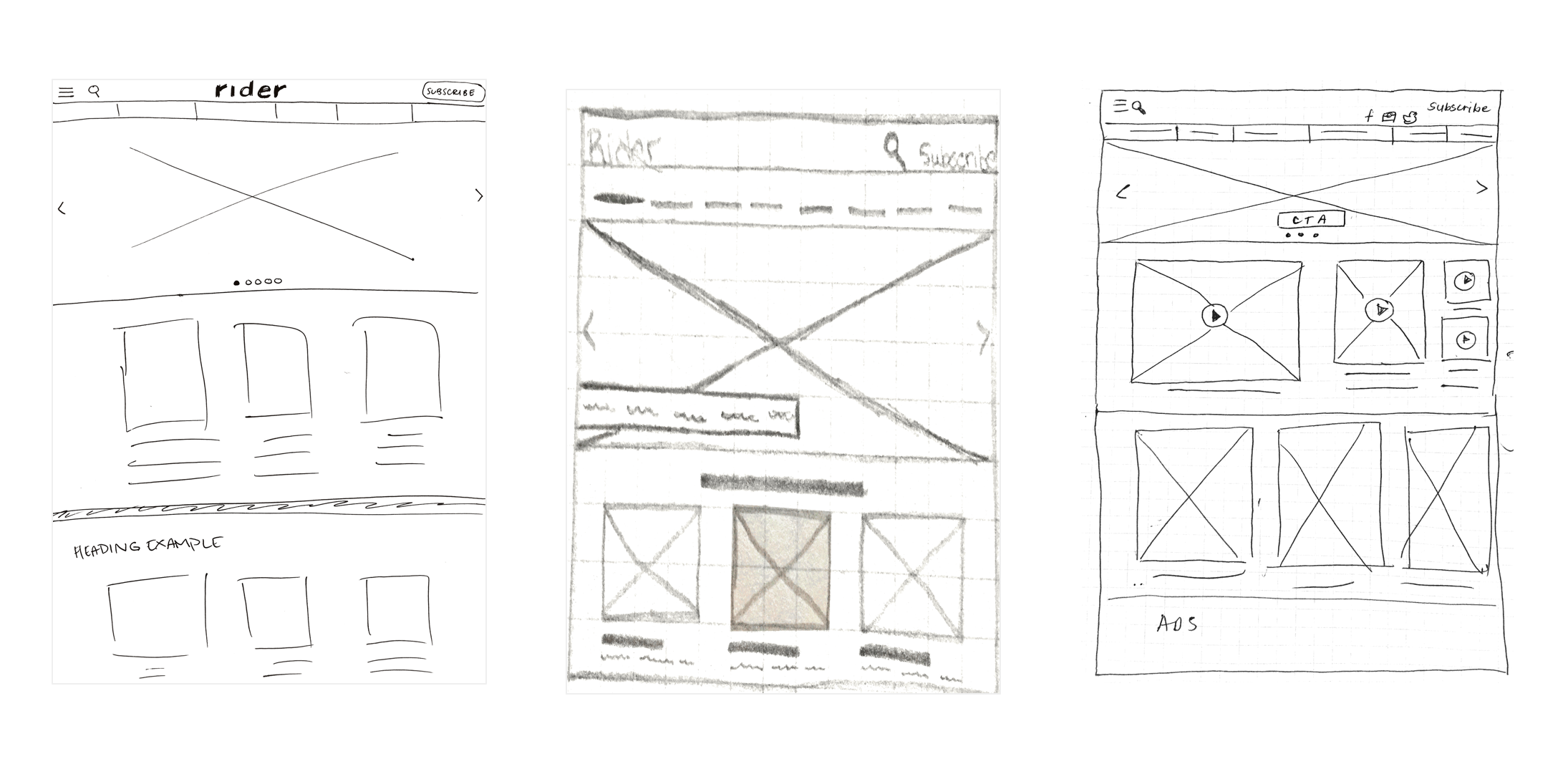
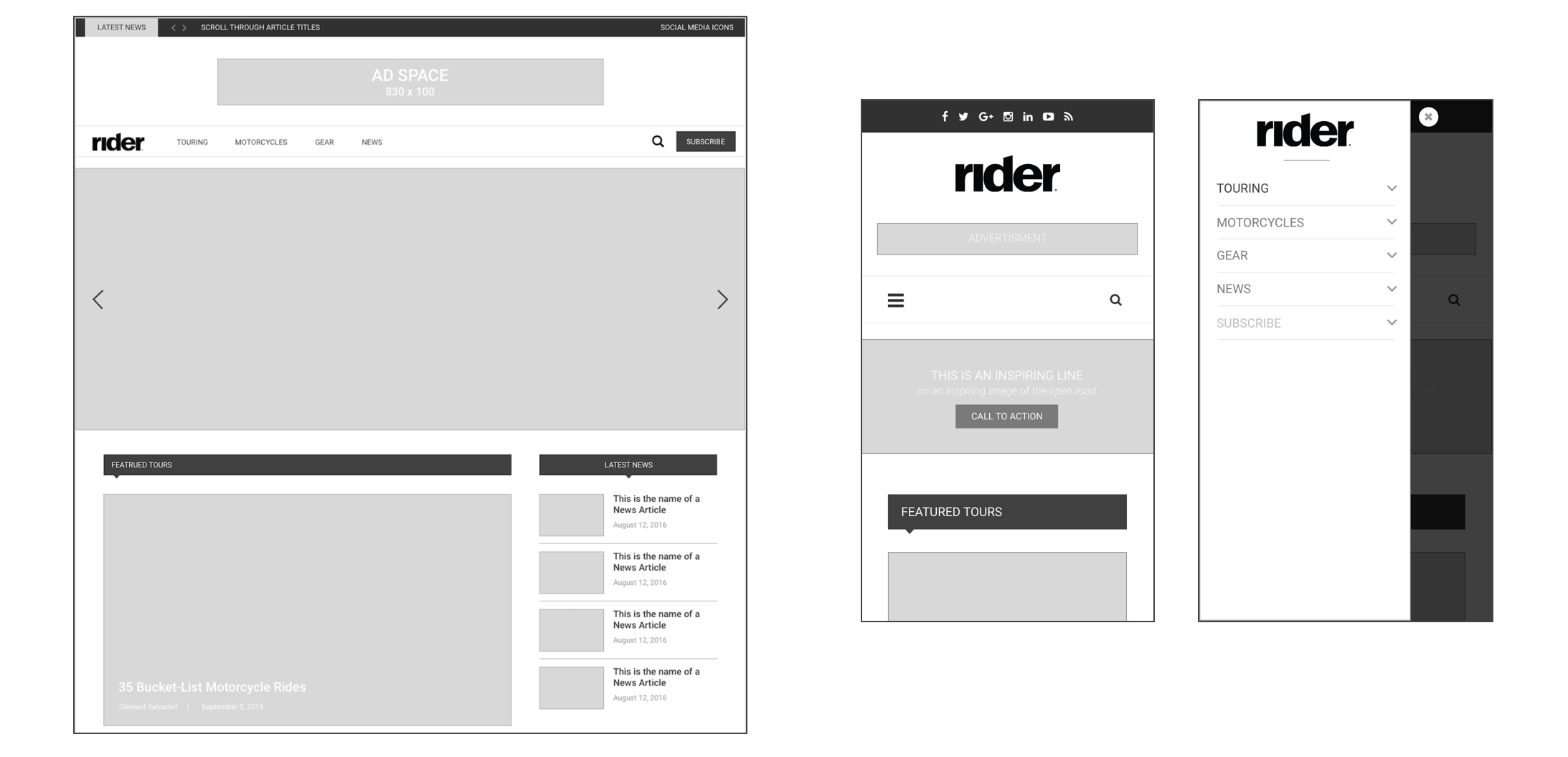
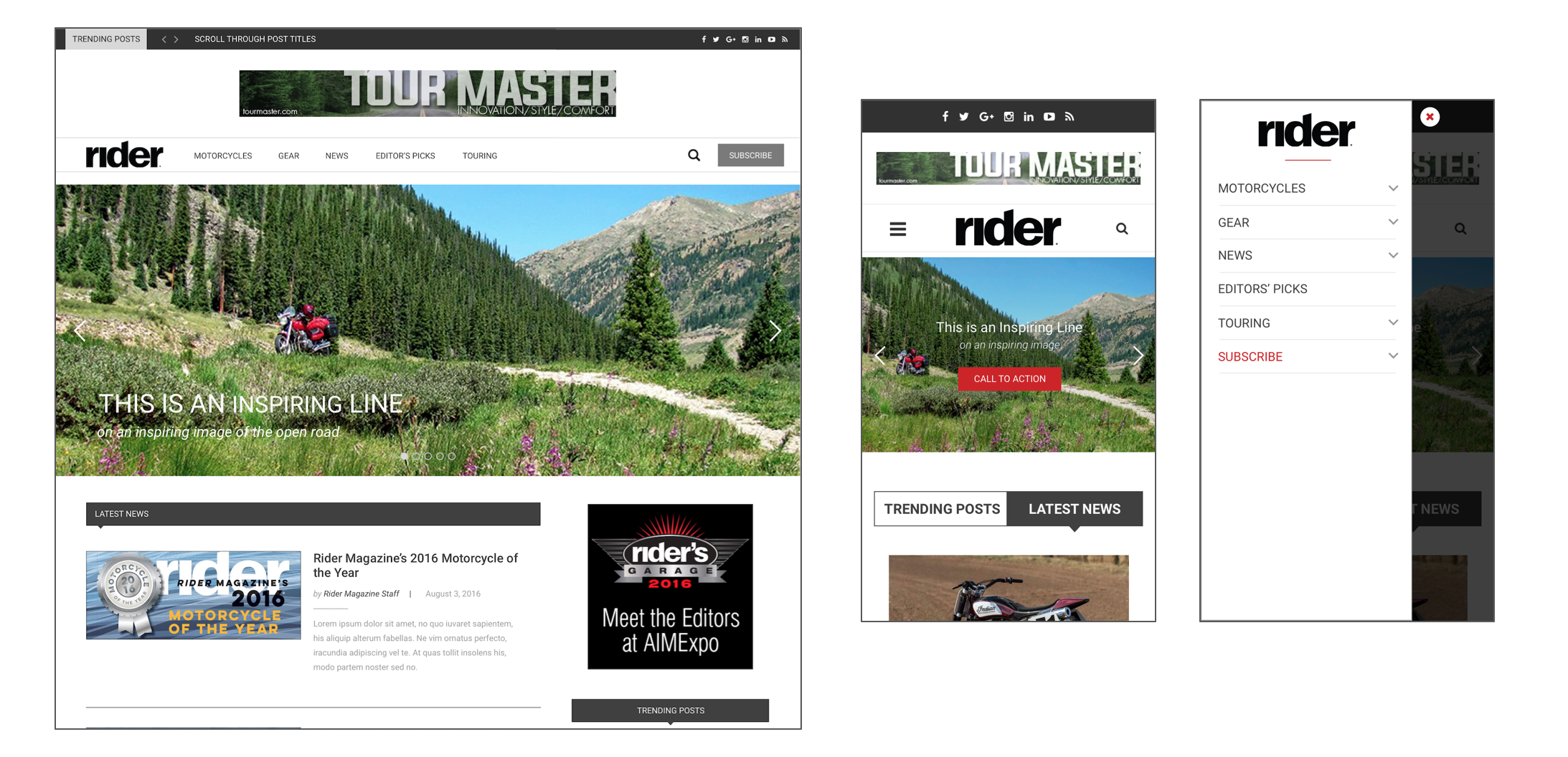
Logo | Hero Image | Subscribe Button | Search Icon | Section Headers and Images
Card Sorting
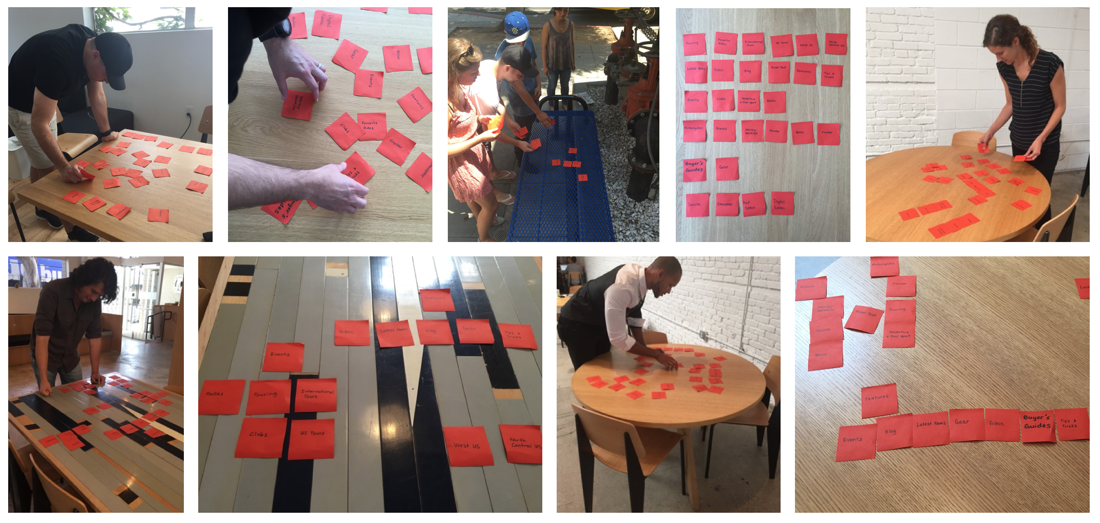
Content Grouping

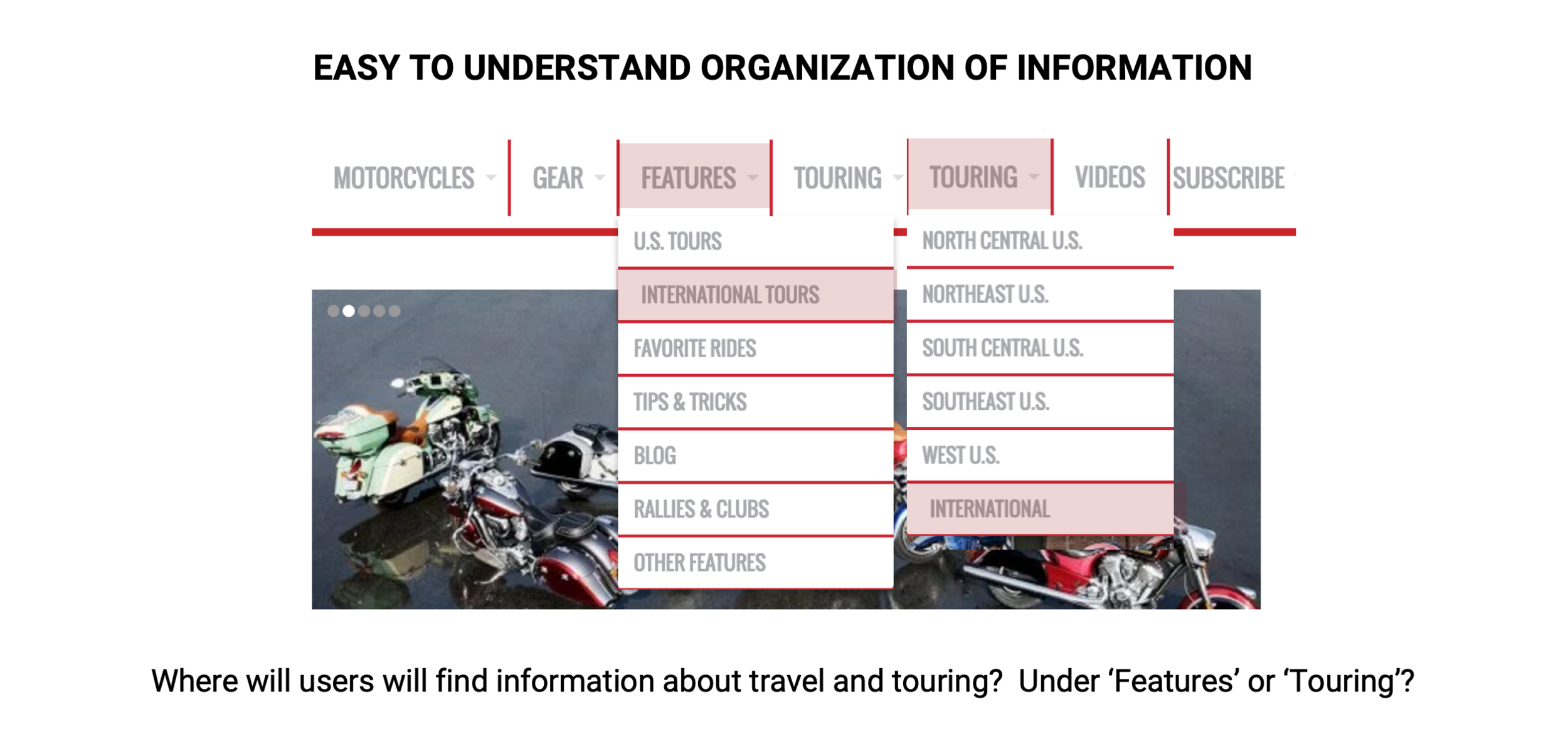
Updated Information Architecture

Content Prioritization

Content Map
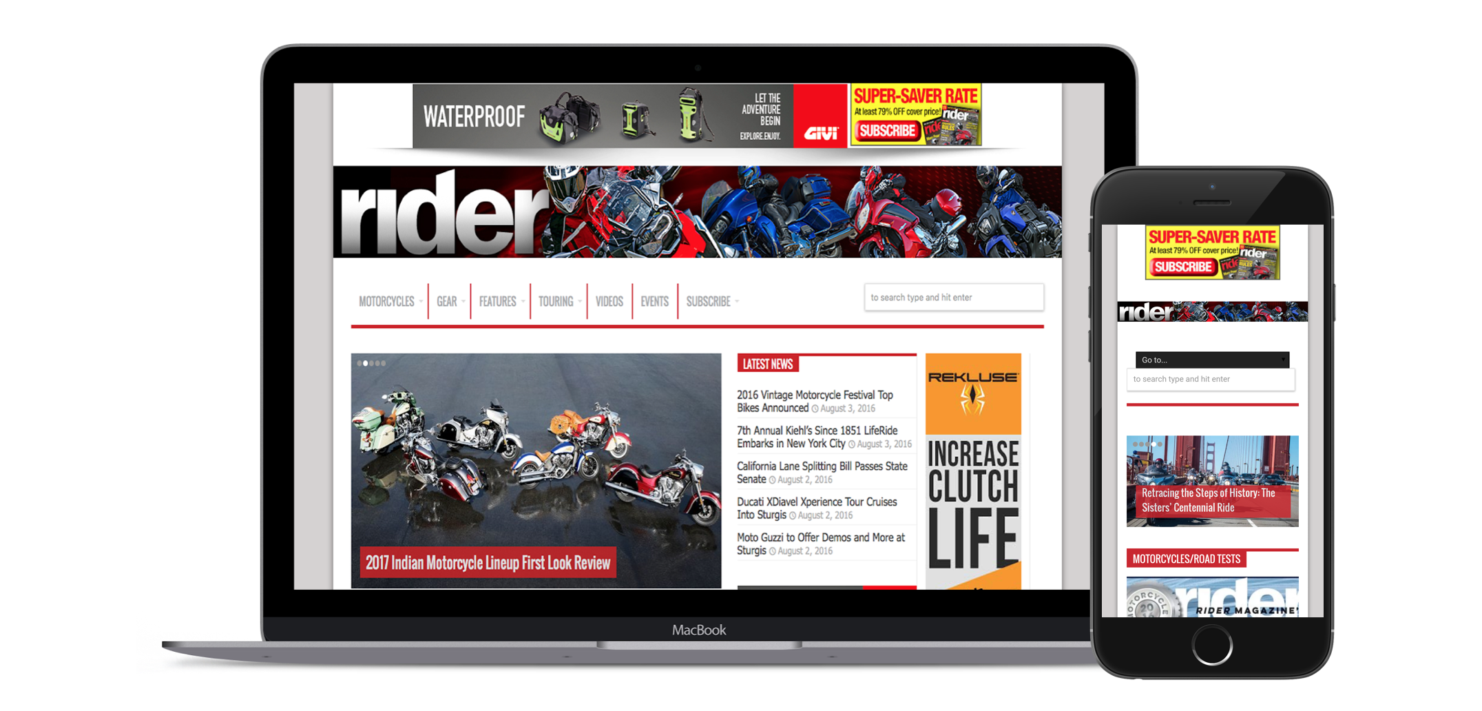
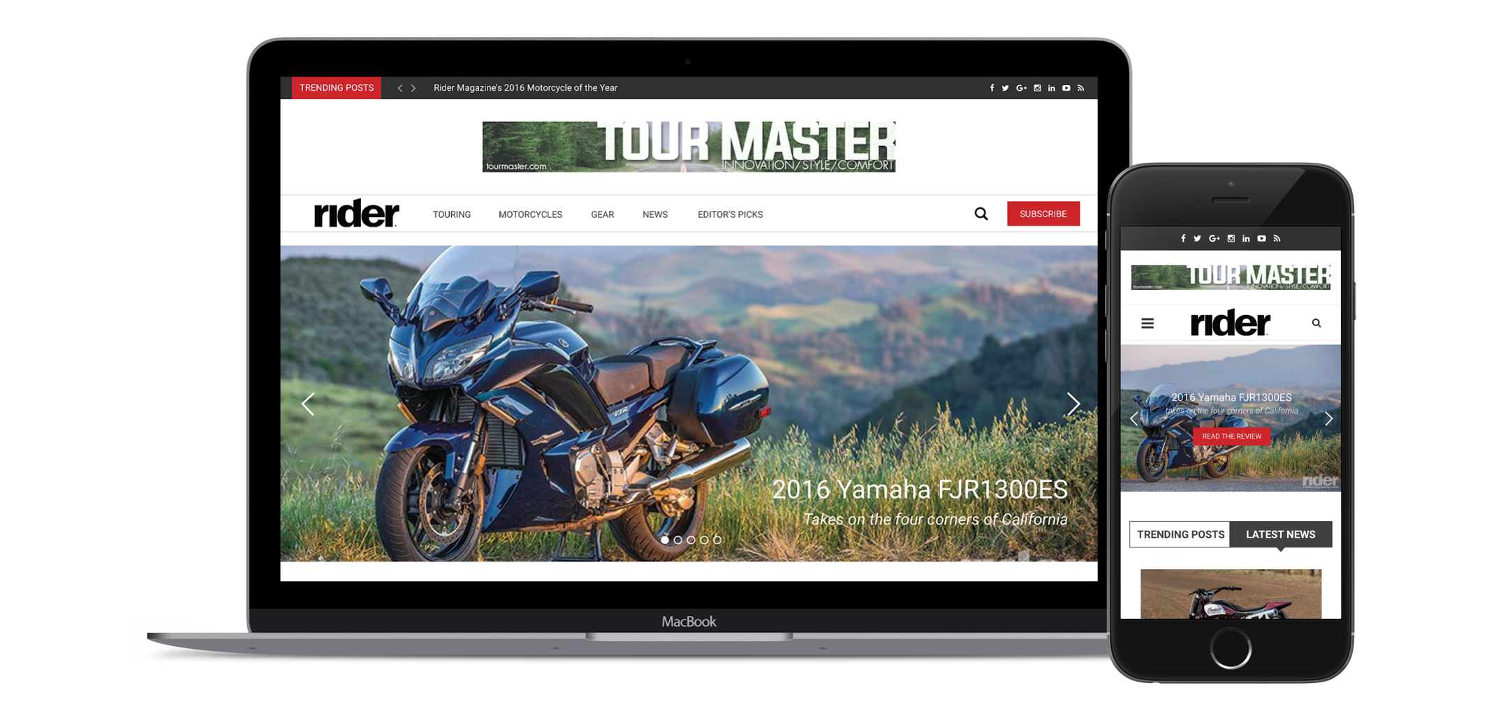
Before & After